Power BI allows users to add a target line to bar charts and a number of other visualizations by modifying the visual’s formatting options. Adding a static line to a bar chart can be a useful technique to help visualize results against a historical average or a KPI.
We’ll explain how to add a static line based on a value that you define or based on a calculation to make your target lines more dynamic.
Table of Contents
Adding a Constant Line to a Bar Chart or Column Chart
Target lines are added to Power BI charts under the Add Further Analysis to Your Visual formatting section’s Constant Line settings. The line is created based on a field which will first require you to create a measure to calculate the target amount for the line which can be fixed or dynamic.
Under the visualizations panel of Power BI, there are three unique sections. Add data to your visual, Format Your Visual, and a third section on the far right labeled Add Further Analysis to Your Visual which is notated by an icon of a magnifying glass with a chart inside of it.
Click on Add Further Analysis to Your Visual to view the Constant Line Section.
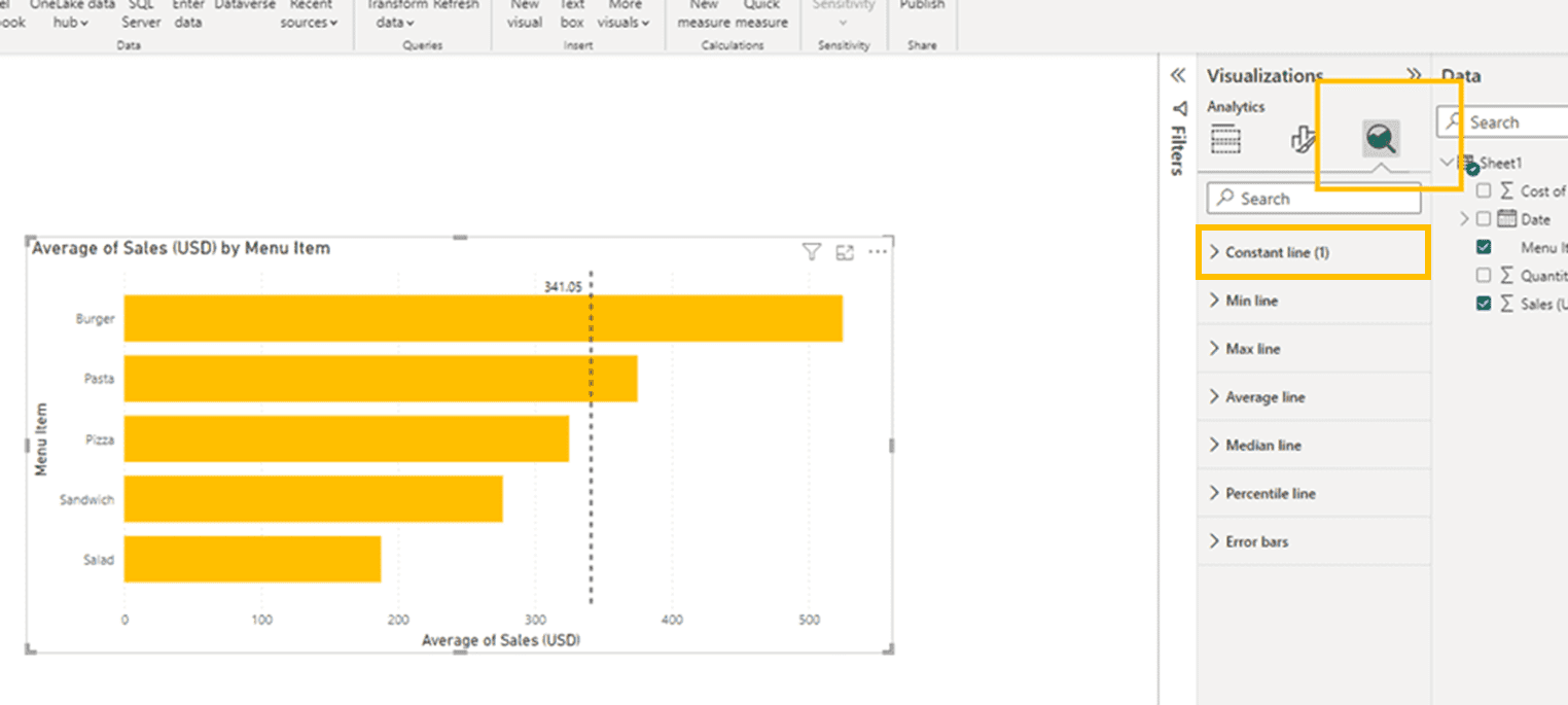
In our example above, you can see that we have already assigned a constant line to the visual, where the Constant Line section will note that there is 1 constant line active. Power BI Allows you to assign multiple constant lines to a single visual.
Note: The search function in the visualization panel of Power BI will only search within a single section. If you search for a keyword like line, you will have to first click on the relevant section.
Under the Constant Line settings you can Add Multiple lines using the “Add Line” button.
Values for each line are assigned under the “Value” section where the number entered becomes the fixed level of the new target line.

Creating a Dynamic Target Line
To add a dynamic Target Line to a Power BI bar chart or other visualization that supports it, Select a visual, then go to Add Further Analysis Section of the Visualizations Panel, and click the Fx button to the right of the value field. It will pop a dialog box where you can select a field and various summarization methods.
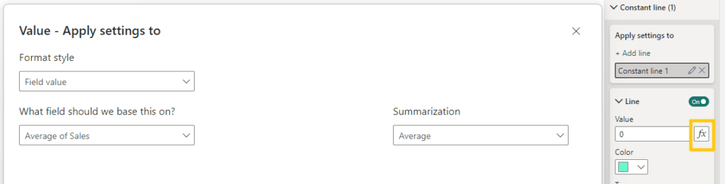
The selections work similar to adding a field as a value to a visualization on the add data to visual tab. It can accept calculated measures with different aggregates such as average and sum.
Overlaying Multiple Charts for Target Lines
If you want a target line that is even more dynamic or want to add a target line to a visual that doesn’t support constant lines, you can overlay two visuals. Create a new Line Chart and custom measure setting the value of the target. Then set the X and Y scale to match your original graph. You can then place the new chart over the old one to create the effect of a target line.
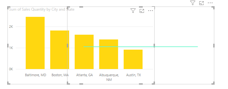
One drawback to this method is that the visual underneath will be difficult for users to interact with as the click will be registered by the layer on top. This specific example could be re-created a number of simpler ways, but we want to highlight what is possible for your own use cases.
Target Line Design Considerations
Constant Lines have a number of formatting options. You can change the color, transparency and color of the lines along with whether they are solid dashed or dotted. Options are available underneath the button where a constant line has been added to the bar chart visual.
When adding lines to bar charts in Power BI, there are a few design considerations to keep in mind.
- Turn off background grid lines on the bar chart to avoid confusion. Gridlines are small mostly transparent lines that can overlap and cause confusion while looking at your bar chart.
- Consider using data labels for columns and disable axis titles for a cleaner look.
- Improve visibility of data labels by enabling backgrounds
- Adjust data label position to be above or below the line. Whether the line is above or behind the bar chart is also adjustable and can improve readability.
Before Optimizing Power BI Visualization Design

After Power BI Design Optimizations

When presenting data in Power BI we believe in the philosophy that less is more. Each item and line that you add to a chart means that it will take a little bit longer for the reader to comprehend the data that they are looking at.
Conclusion
Adding a line to a bar chart in Power BI can be a powerful way to show how results compare to a target amount. Targets are typically static numbers but can be dynamic calculations. You can even use custom measures to define the target line prior to setting up a constant line. For even more dynamic target lines consider layering multiple charts on top of each other.