Power BI offers several options for forecasting data. We explore time-series forecasting using the line chart and some of the other options available to add predictive analytics into your reports and dashboards.
What is Time Series Forecasting?
Time series forecasting is a technique used to analyze and predict future values of a time-ordered data set. The forecasting model uses data from prior dates and uses it to predict future results. Time Series forecasts can be adjusted for seasonality, and for different lengths of time.
How to Prep Power BI Data for Forecasting
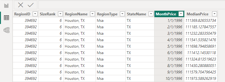
You will need to have starting data that is in a tabular format, has a date column, and has a at least one data column that you want to predict. In this example, we have a date column called MonthPrice and a MedianPrice column that we can use to predict.
Each row must have a date assigned to it. It’s the column of historical data that Power BI will use to create the forecast.
Note: Sometimes your dates will have gaps in it, and Power BI will have trouble creating visuals with it. If this happens, you may need to create a date table using a formula like the one below. The DateTable can then be connected to your data using the relationship builder.
DateTable = CALENDAR(DATE(2022, 1, 1), DATE(2030, 12, 31))
Add a Power BI Forecast Using a Line Chart
The Line Chart Visual is the standard way to create a forecast in PowerBI. Other than the line chart, users are required to create custom DAX formulas, or resort to embedding R or Python Scripts.
Follow these instructions to create a line chart with your data and add a forecast line to it. Once the forecast line and various visual options are established, you can export the final forecast from Power BI into a .csv that can be opened in Excel.
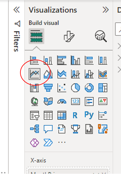
Step 1.) Insert a Line Chart from the Visualizations Pane on the right of your report.
Step 2.) Setup the X Y axis of your chart, including the Date Column of your data
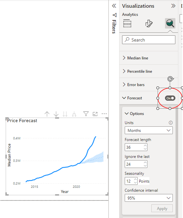
Step 3.) Click on the Magnifying Glass of the Visualization Pane to add further analysis to your visual.
Step 4.) On the bottom of the set of options there is a section called “Forecast”, turn it on. If you can’t find it you can also search for Forecast in the box at the top. It’s often a time saver vs. trying to find the menu that you want in the configuration panel.
Configuring Different Forecast Options
After enabling the forecast option, there are several settings that you can adjust to fit the needs of your forecast data.
Forecast Units
Most commonly in finance and accounting use cases you will set Units to Months. This is the most important setting of the forecast because all other parameters will be based in these units.
Forecast Length
Forecast length is the number of future periods that you want to forecast. If you selected Months as your Units, you will be predicting 12, 24, 36 months etc.
Ignore the Last
Depending on your data, this could be zero or it could be longer. Sometimes it makes sense to ignore the last 1 month if you have a live data connection to an accounting system and the data for the month is not finalized. You may want to exclude it. This setting will depend on your specific use case.
Seasonality
Many companies will use 12 seasonality points when looking at monthly sales data. This will vary by your use case. The idea is that sales can be higher going into the Christmas holiday, and lower in the spring. The forecast model will try and adjust for these highs and lows but needs to know how many periods or months to look back for a full sales cycle.
Confidence Interval
Power BI will generate a confidence band and will not give you a specific number for a forecast. Because it does not know the future there are many different outcomes that could occur. Lower confidence intervals will create a more narrow band and higher confidence intervals will create a wider band.
It’s basically saying that based on historic data, it’s 95% sure that future sales will fall within a specific range.
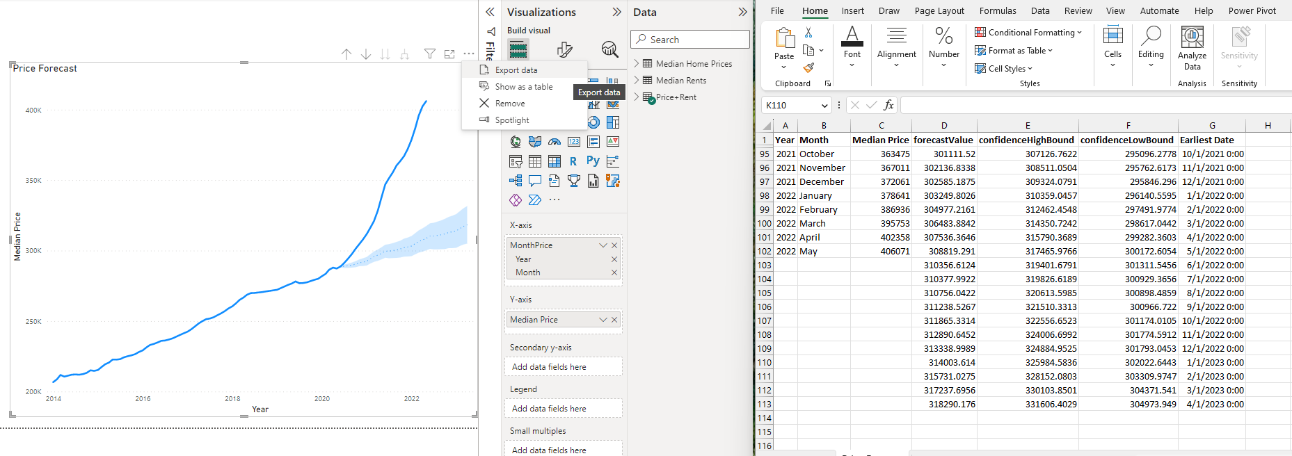
How to Export a Forecast from Power BI
If you want to get the forecast in a format that you can use in Excel, click the . . . dots at the top right of the line chart visual and export the data. It will output as a csv file that can be opened in Excel.
Additional Forecasting Options in Power BI
Most of the forecasting functionality in Power BI is built into the line chart visual. If you are looking for alternatives, you can create DAX measures that do the calculations for you.
Power BI includes limited forecasting models but you can use a simple moving average, to calculate the average over the last several months. To use this to look into the future, you may have to create a custom date table so the visual being used goes out to the future period you are trying to predict.
The LINEST DAX measure could also be used to perform liner regression. If you go down the path of creating custom DAX measures, we recommend using ChatGPT as a guide for Power BI DAX Measures.
The final option that you have available for forecasting is to use custom Python and R Scripts that can be executed from PowerBI. Outside of the data science world it’s unlikely that this method would be used. Power BI is fantastic at creating beautiful visuals but currently lacks advanced features that would be available in other platforms.