Power BI KPI Cards allow report developers to present comparative data in a single card, with the option of adding a chart behind the value to quickly see how the trend has changed over-time. We’ll explain what Power BI KPI Cards are and how to set them.
Table of Contents
What is a Key Performance Indicator (KPI)?
A Key Performance Indicator, commonly abbreviated “KPI” is a measurable value that shows how well a business is achieving key business objectives. Businesses will use KPIs to break down complex operations into smaller bite size metrics that can be tracked over time. KPIs help managers make more informed decisions and monitor performance over time.
KPIs typically vary by industry and individual business, but some common ones that we find most often include the following.
- Change in Sales
- Customer Satisfaction Scores
- Inventory Turnover
- Return on Investment
As you can see there is quite a range of different business topics a KPI can cover, but there is some commonality between these metrics to keep in mind for setting up a KPI visual in Power BI.
An Overview of Power BI KPI Cards
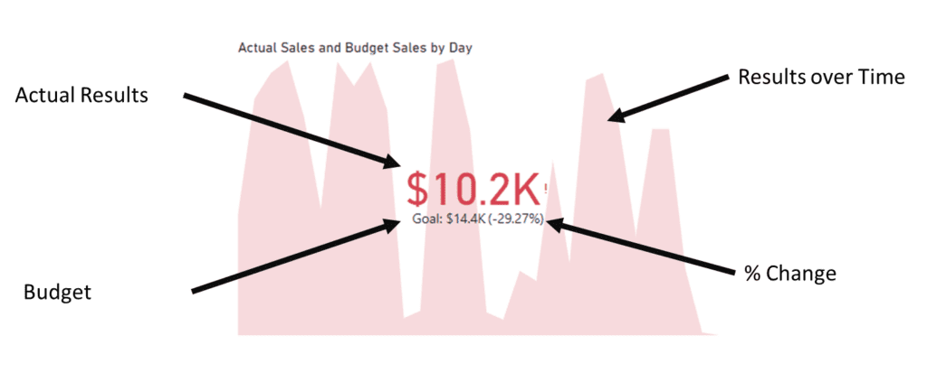
The KPI Card in Power BI is purpose built to present Key Performance Indicators. It has unique capabilities to present actual results compared to a goal or budget, auto-calculates a percentage change, and accompanies the information with a graph of performance over time. A KPI visual can present a large amount of information in a single visual.
Because the KPI card includes several built-in calculations, the setup of it requires three different components.
- Actual Results
- A Target or Budget to Compare Against
- A Date to present time-series change
KPI Cards are a powerful visualization to show a lot of information at a time. Compared to a card visual they can be much more impactful.
How to Setup Power BI KPI Cards
To setup a KPI card in Power BI, click on the KPI card from the Visualizations Panel. Users will be presented with a Value, Trend Axis, and Target Field to add fields to. These fields correspond to the actual results, the target or budget for comparison against actual, and a trend axis to present the comparison over time.
These are the steps to setup a KPI visual
Step 1.) Setup the Power BI data model
Because Power BI will want to compare actuals against a target value over time, it’s best to setup the incoming data to be presented in a way that can easily be compared. In our example dataset, we have a column for dates, and a column for actuals and budget. Each budgeted and actual value corresponds to a date.

While this exact setup isn’t always possible, you should at least try to match actual results with a target amount. For example, monthly target values should correspond to monthly actuals.
Step 2.) Insert a KPI Card
After your data model is setup to allow for easy comparisons between values, insert a KPI Card from the Power BI Visuals Panel.

Step 3.) Assign Fields to the KPI Card
Here is a quick breakdown of what each one of these fields does.
- Value – Actual or current results presented as a value.
- Trend Axis – This is the date field used to compare KPI performance over time.
- Target – Target or budgeted results that the actual value is being compared against.

The following screenshot shows what the visual looks like with fields assigned to it, and some simple formatting changes.

In our example, we assign sales, budget, and date. The date field that we added is setup to only show a daily comparison, but try different views. It can be setup to show days, months, years or become a drillable date hierarchy.
The visual presents a daily sales goal of $14,400 against actual results of $10,200 representing a failure to reach the daily sales goal by 29.27%.
The chart behind it shows the actual daily sales trend over each day of the month.

We think the chart portion of the KPI card is one of the most confusing, because it does not actually represent a comparison against a target value. Another way to look at this is with the target value removed. The chart behind the actual and target values does not change, but the conditional formatting is removed.
Power BI KPI Cards and Date Fields
When setting up a KPI card, ensure that the date field being used matches the time comparison that you wish to achieve. If you want to compare today’s sales against prior day sales, data must be at the individual day level. If you wish to present a year over year or month over month the data must be available in a way that can be aggregated in Power BI.
For example, the following screenshot attempts to present current month sales data compared against prior month data when it does not exist within the dataset.

Power BI is only able to present the data that it has available. So it will show actual results, and the prior period values look like an error and the conditional formatting does not make sense.
Rather than presenting with a Can’t Display the Visual Error, it looks like the visualization isn’t working as intended, but is typically fixed by adjusting the data model or a measure.
Creating Date Comparisons in DAX
Measures to calculate prior period totals can be completed using the following DAX formula template. In this example, we calculate the sales for the previous day using the PREVIOUSDAY formula.
Cookie Sales is the name of our table, Actual Sales is the field name of values, and Date is our date column.
Prior Day Sales =
CALCULATE(
    SUM('Cookie Sales'[Actual Sales]),
    ALL('Cookie Sales'),
    PREVIOUSDAY('Cookie Sales'[Date])
)
A quick breakdown of the parts of the DAX formula are as follows:
- CALCULATE – Tells Power BI to ignore any slicers or filters that are already on the page.
- SUM – Assigns an aggregation method for the calculation.
- ALL – Tells Power BI which filters on the page to ignore. We’re telling it to ignore all of them.
- PREVOIUSDAY – This is the new filter for the measure, we are telling Power BI to filter on previous day sales.
Other common filters are PREVIOUSMONTH or SAMEPERIODLASTYEAR. They can also be setup using Power BI Quick Measures.
KPI Card Formatting Options in Power BI
To customize a KPI visual, navigate to the Format Your Visual options on the Visualization Panel of Power BI. These settings allow you to choose which components are presented and lets you adjust the graph, and conditional formatting for coloring.
Callout Values
The callout value options refer to the large numbers in the middle of a KPI card. These are the actual results that you are comparing against a goal or target value that is assigned and presented below the actuals. Formatting options are fairly standard and include things such as alignment, font size, and decimal places.
Modifying the alignment will adjust not only the callout value, but the target value as well to prevent them from becoming misaligned.

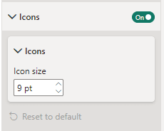
Icons
Icon settings for the KPI visual are a bit disappointing. You can adjust the size of the standard icon, but you cannot adjust the actual icon. This limits it to an exclamation point or a check mark. We wish Microsoft included an option to include arrows up down or different comparative icons.
Trend Axis
Trend axis settings allow you change a KPI comparison from High is Good to Low is Good. You can also adjust the color scale of good to bad in these settings.

Disable the Trend Axis under the KPI visual formatting options to disable the graph that appears behind the KPI actual and target results.

Target Label
Target label options are similar to callout values, but only impacts the target or budget numbers that appear below the actual results.
Date
The date portion of a KPI visual is disabled by default but can be enabled to highlight the specific comparison date that is being presented. We prefer to enable this if there is not another location in the Power BI dashboard that lets readers know when a report was last updated or if there is a specific as of date being presented.
The following video highlights some additional features and customizations that can be done with card visuals to create a more custom KPI experience for your readers.