Microsoft released a New Card Visual that adds many features to the original card visual including the ability to align text, customize the shape, and even present multiple KPI’s at the same time. The new Card Visual experience makes it easier to present multiple metrics at one time and even improves report render speed by reducing the total number of unique visuals on a page.
Table of Contents
What is the New Card Visual in Power BI?
The New card visual was released in Public preview in June of 2023 to fix a number of limitations that exist with the classic card visual. To use it, you may need to enable the Preview Feature in Power BI Desktop to make it visible. Once enabled, it complements the standard card visual as another visualization option on the visualizations panel.
With the new visual from Microsoft, you gain the ability to work with multiple values on one card and gain access to advanced formatting features that otherwise require workarounds or were not previously possible.
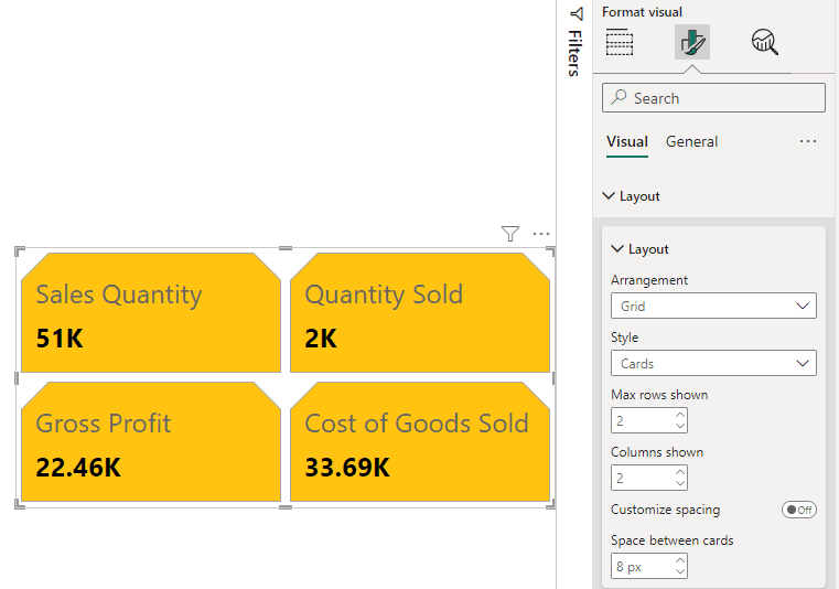
The New Card Visual Supports Multiple Fields
One of the biggest changes with the New Card Visual in Power BI is the ability to assign multiple fields to a single visual. In the example below, we add 3 different fields to a single visual, where they can be further formatted as a series or individually.
Simply add the New Card visual to your report page and drag and drop multiple fields to the Data section of the visual configuration options.

Layouts can further be adjusted under formatting options to present the data as a grid, columns or rows.
How to Align Card Visual Text in Power BI
The New Card Visual in Power BI allows users to adjust the Horizontal Alignment of the text inside of the card. Add a Card(new) visual to your report page, then navigate to the formatting options tab, callout, values section where you can select whether to align left, align center, or align right.

Historically, users were forced to use a workaround like using a Q&A Visual to align right or a multi-row card visual with the accent bar turned off for a left alignment. Now it’s available directly in the card visual settings.
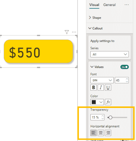
Along with adding the ability to align text within a text card in Power BI, the new card visual also allows dashboard designers to adjust the transparency, font, color and more within the card visual. Changes can be applied to the entire series of fields assigned to the visual, or you can apply them individually.
Adjusting One or All Field Formats
When working with the new card visual, you can choose whether to apply settings to all series or use the series dropdown menu in the format options to select a specific field. All of the regular formatting options are available but now you can avoid having to adjust separate cards individually or with the format painter.

Adjusting the Shape of a Card Visuals
Using the New Card Visual in Power BI, users can adjust the shape. New options include rounded rectangle and snipped tab. Both visuals are fully customizable to allow for rounding or snipping of each corner, or selectively. This eliminates the step of adding a shape and grouping a card visual to it, though you still have the ability if you want to work with custom images.

You can mix and match the new shapes with drop shadows, outlines and other pre-existing formatting options from the original card visual.
How to Enable Preview Features in Power BI
Depending on the version of Power BI Desktop you are running, the New Card Visual may not be available by default, but you can enable it as a preview feature by going to: File > Options > Preview Features and select New Card Visual.

Preview features are constantly changing, but features that make it into Power BI Desktop typically become standard release features. When using the New Card visual it will publish to PowerBI.com and be available for end users to see. If you share a pbix file with other developers they will need to have the feature enabled and run a version of Power BI Desktop that supports the visual.
Conclusion
There are a lot of exciting changes to the Power BI text card visual that will make developing dashboards and reports easier than ever. With the ability to align text, modify custom shapes, transparency, coloring, adjust text formatting to a very specific level all are welcome changes that people have been asking about for years.